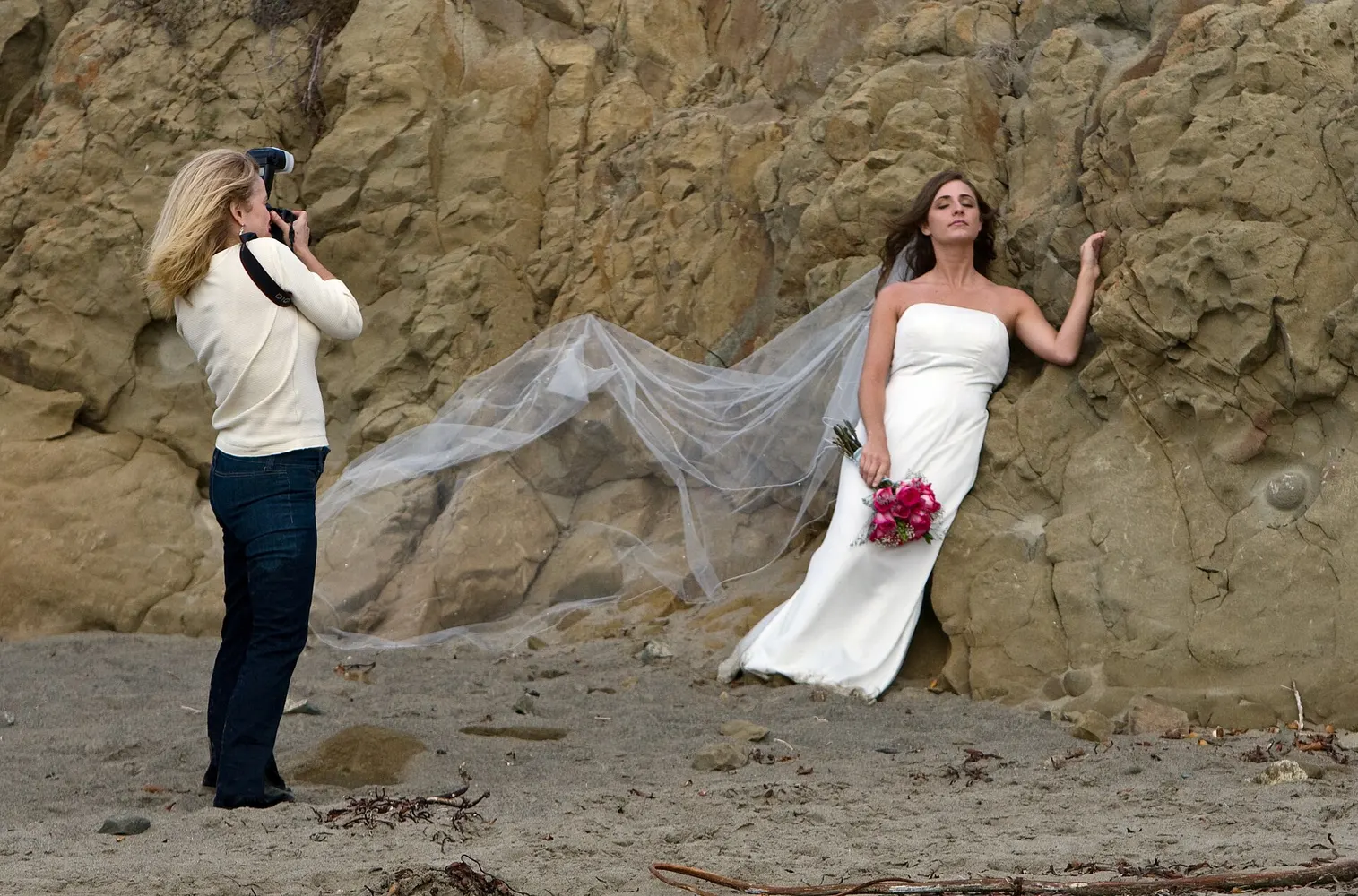
A photographer’s website is judged in the first swipe. The visitor came from Instagram or a Google search, they are on a phone, and they are comparing you to four other people in the same tab. The first screen has to show your best frame at full width, load before they lose patience, and say what you shoot and where.
Then the site does what the grid cannot. It sorts the work by genre so a bride does not scroll past product shots. It puts starting prices on a packages page so the inquiry that comes in can afford you. It asks the qualifying questions on the form: date, venue, what the shoot is for, rough budget. A form that asks nothing gets DMs that go nowhere.
Behind the form sits the business. A contract and a retainer collected in one step so the date is held that night. Client galleries where families pick favorites and order prints. A follow-up text when an inquiry goes unanswered, and a review request when the gallery is delivered. Video gets its own treatment, with reels hosted so they play without stalling the page.
Under all of it, the search layer: a page for each genre and each city you shoot in, so a search for a headshot photographer in Pasadena or a real estate videographer in Newport Beach lands on a page about that, not a homepage that covers everything. Image alt text, schema, and a Google Business Profile that matches the site, because photographers get found on Maps too.